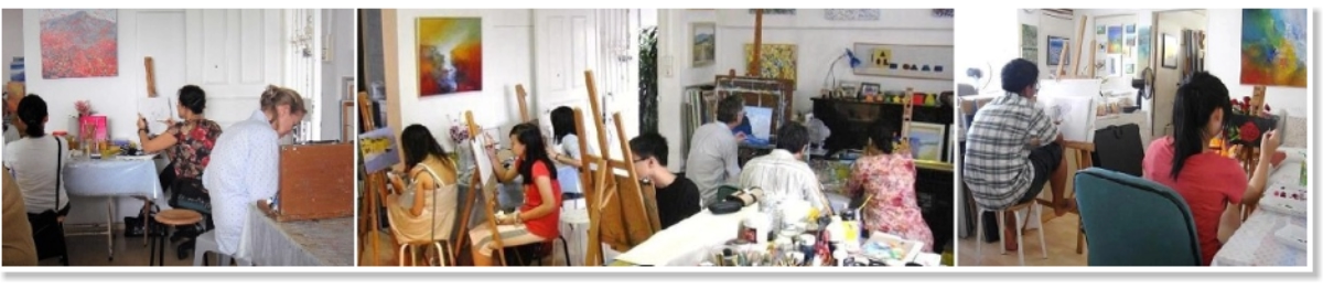
These three framed paintings share a common language of vertical
hand-drawn lines in pastel-like colours, yet they each communicate
distinct emotional tones and moods.
Let’s look at them individually and comparatively.
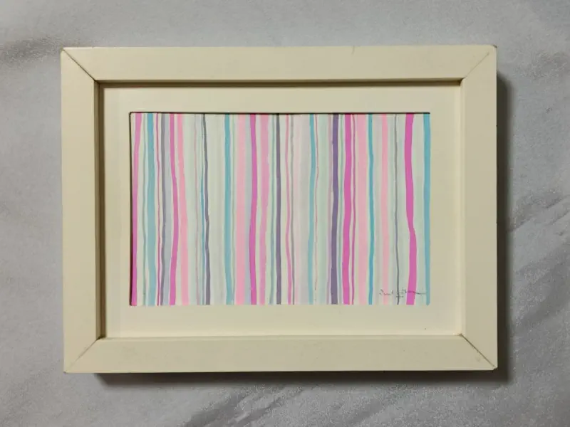
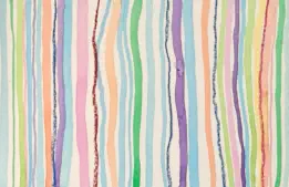
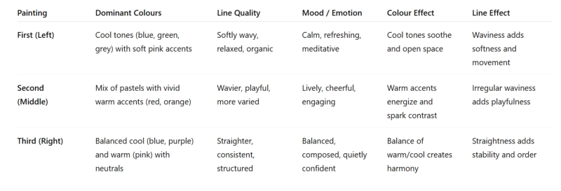
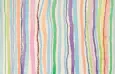
1. First Painting (Left)
•
Visual qualities:
o
Soft, slightly wavy vertical lines in pastel blue, pink, light green,
and grey.
o
Lines are not perfectly parallel — they undulate subtly, giving a
relaxed, flowing feel.
o
Colour palette is cool-dominant (blue and green tones) with
gentle pink highlights.
•
Mood & emotion:
o
Calm, refreshing, and slightly meditative.
o
Cool colours soften the visual impact and evoke openness, air,
and quiet.
o
The gentle waviness adds an organic, water-like quality — it feels
like ripples or drizzles, which soothes rather than excites.
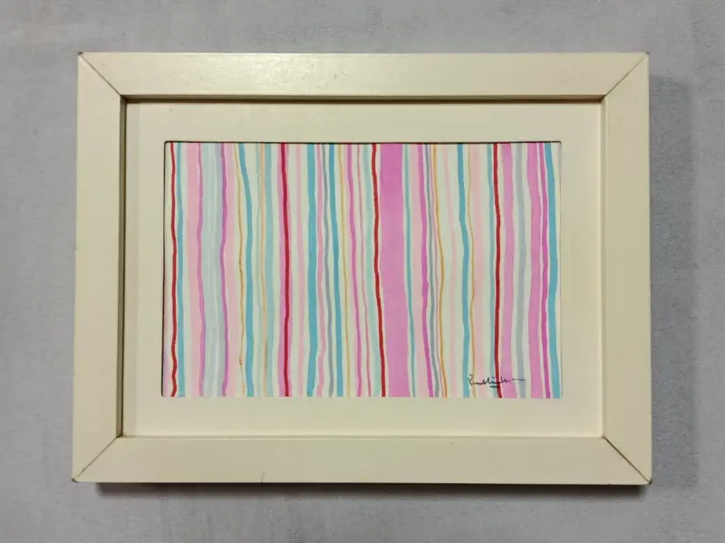
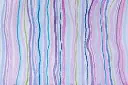
2. Second Painting (Middle)
•
Visual qualities:
o
Brighter colour palette with pink, sky blue, orange, and especially
a striking red line.
o
Lines are a mix of soft pastel tones and more vivid accents.
o
The waviness is slightly more pronounced; lines feel playful and
animated.
•
Mood & emotion:
o
Livelier and more cheerful than the first.
o
The red and orange introduce warmth and energy, creating
moments of visual "spark" among the softer pastels.
o
Feels like a conversation between calm and excitement — the
warmth breaks the cool calmness, making it more social and
uplifting.
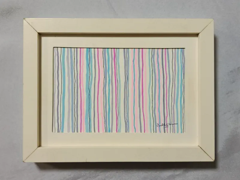
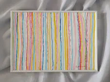
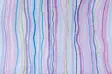
3. Third Painting (Right)
Visual qualities:
•
More even distribution of cool and warm tones, with pink,
purple, blue, and some neutral whites and greys.
•
Lines are straighter and more regular compared to the first two
paintings.
•
Colour blocks feel slightly more distinct, and the composition
looks more structured.
•
Mood & emotion:
o
Balanced and composed.
o
The straightness and consistency of the lines give a sense of
order and stability.
o
The cooler blues and purples keep it calm, while pinks add
warmth, resulting in a quiet confidence rather than playfulness.
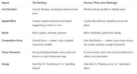
Side-by-side visual-emotion chart for quick comparison:


Emotional Tones and Moods
Link:
Rhythmic Lines & Harmonious Hues
Meditative Art of Lines 1
Meditative Art of Lines 2
Abstract Landscape Painting
A Moment of Presence
Emotional Tones and Moods
From Fragments to Horizons
Discussion of this painting
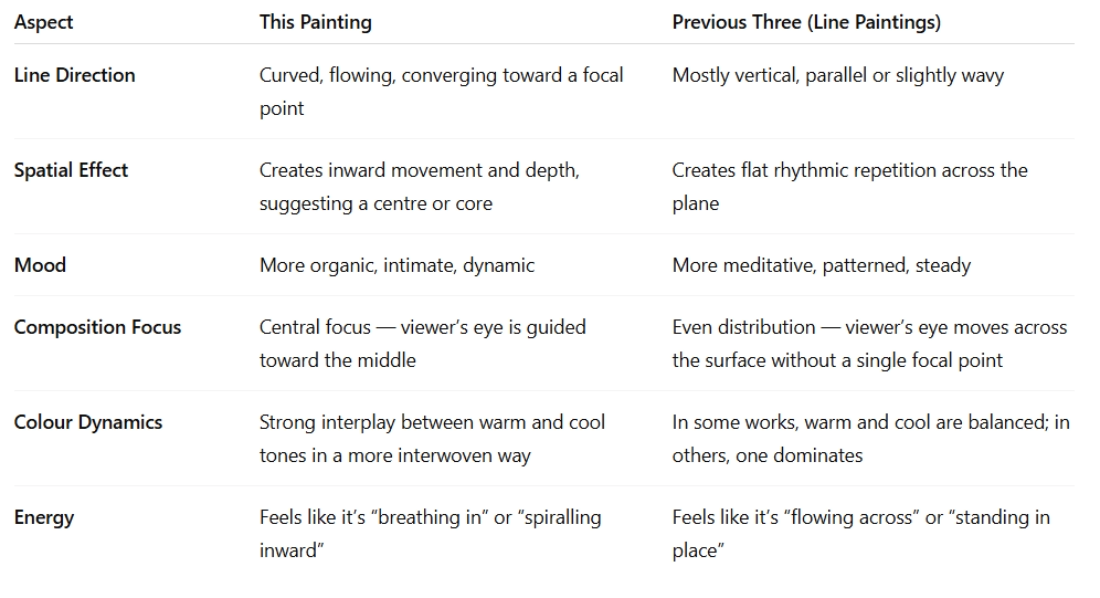
Composition & Form
•
The painting consists of flowing, ribbon-like lines that curve
inward toward a central, almond/eye-shaped form.
•
The lines are layered, with varying thicknesses and irregular
spacing, creating a sense of depth and movement.
•
The central “enclosure” feels like it holds an inner space, giving
the work a focal point and a sense of containment.
Colour Palette
•
Bright yet soft pastel hues: pinks, blues, greens, yellows,
purples, and oranges.
•
Warm and cool tones are interwoven, producing both vibrancy
and harmony.
•
Orange and yellow add sparks of warmth; cool blues and
greens soothe; pinks and purples soften the composition.
Mood & Emotion
•
Feels dynamic and organic, like the cross-section of a shell, a
seed pod, or flowing fabric.
•
The curving inward movement creates a sense of being drawn
in — introspection, gathering energy, or holding something
precious.
•
Colour rhythm and line flow suggest both liveliness and
gentleness, giving the painting an embracing quality.
Comparison with the previous three paintings
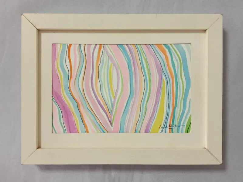
Currents of Stillness
This series traces a quiet journey through colour and line, moving from
the surface calm of outer rhythms to the inward embrace of a
hidden core. Each painting reveals a stage of this unfolding:
Gentle Drift opens with soft, wavering lines in cool hues, evoking rain,
breeze, or the steady breath of contemplation.
Joyful Currents follows with playful waves of colour — red and orange
cutting through pastels — reminding us that stillness is not the
absence of energy, but its dance in balance.
Quiet Balance steadies the rhythm, as straighter lines weave warmth
and coolness into measured harmony, a state of poised composure.
Heart of Flow gathers the wandering lines inward, spiraling toward a
centre. Here, stillness deepens into intimacy — an embrace of
colour, form, and space.
Together, these works invite us to see how repetition and variation,
wavering and centering, mirror the patterns of inner life. Calm is not
static: it drifts, it plays, it balances, and at last, it embraces.
Emotional Tones and Moods
These three framed paintings share a common
language of vertical hand-drawn lines in pastel-like
colours, yet they each communicate distinct
emotional tones and moods.
Let’s look at them individually and comparatively.
1. First Painting (Left)
•
Visual qualities:
o
Soft, slightly wavy vertical lines in pastel blue,
pink, light green, and grey.
o
Lines are not perfectly parallel — they
undulate subtly, giving a relaxed, flowing feel.
o
Colour palette is cool-dominant (blue and
green tones) with gentle pink highlights.
•
Mood & emotion:
o
Calm, refreshing, and slightly meditative.
o
Cool colours soften the visual impact and evoke
openness, air, and quiet.
o
The gentle waviness adds an organic, water-like
quality — it feels like ripples or drizzles, which
soothes rather than excites.
2. Second Painting (Middle)
•
Visual qualities:
o
Brighter colour palette with pink, sky blue,
orange, and especially a striking red line.
o
Lines are a mix of soft pastel tones and more
vivid accents.
o
The waviness is slightly more pronounced; lines
feel playful and animated.
•
Mood & emotion:
o
Livelier and more cheerful than the first.
o
The red and orange introduce warmth and
energy, creating moments of visual "spark"
among the softer pastels.
o
Feels like a conversation between calm and
excitement — the warmth breaks the cool
calmness, making it more social and uplifting.
3. Third Painting (Right)
Visual qualities:
•
More even distribution of cool and warm tones,
with pink, purple, blue, and some neutral
whites and greys.
•
Lines are straighter and more regular
compared to the first two paintings.
•
Colour blocks feel slightly more distinct, and
the composition looks more structured.
•
Mood & emotion:
o
Balanced and composed.
o
The straightness and consistency of the lines
give a sense of order and stability.
o
The cooler blues and purples keep it calm,
while pinks add warmth, resulting in a quiet
confidence rather than playfulness.
Side-by-side visual-emotion chart for quick
comparison:
Link:
Rhythmic Lines & Harmonious Hues
Meditative Art of Lines 1
Meditative Art of Lines 2
Abstract Landscape Painting
A Moment of Presence
Emotional Tones and Moods
From Fragments to Horizons


Discussion of this painting
Composition & Form
•
The painting consists of flowing, ribbon-like lines
that curve inward toward a central, almond/eye-
shaped form.
•
The lines are layered, with varying thicknesses and
irregular spacing, creating a sense of depth and
movement.
•
The central “enclosure” feels like it holds an inner
space, giving the work a focal point and a sense of
containment.
Colour Palette
•
Bright yet soft pastel hues: pinks, blues,
greens, yellows, purples, and oranges.
•
Warm and cool tones are interwoven,
producing both vibrancy and harmony.
•
Orange and yellow add sparks of warmth;
cool blues and greens soothe; pinks and
purples soften the composition.
Mood & Emotion
•
Feels dynamic and organic, like the cross-
section of a shell, a seed pod, or flowing
fabric.
•
The curving inward movement creates a
sense of being drawn in — introspection,
gathering energy, or holding something
precious.
•
Colour rhythm and line flow suggest both
liveliness and gentleness, giving the painting
an embracing quality.
Comparison with the previous three paintings
Currents of Stillness
This series traces a quiet journey through colour
and line, moving from the surface calm of outer
rhythms to the inward embrace of a hidden core.
Each painting reveals a stage of this unfolding:
Gentle Drift opens with soft, wavering lines in cool
hues, evoking rain, breeze, or the steady breath
of contemplation.
Joyful Currents follows with playful waves of
colour — red and orange cutting through
pastels — reminding us that stillness is not the
absence of energy, but its dance in balance.
Quiet Balance steadies the rhythm, as straighter
lines weave warmth and coolness into
measured harmony, a state of poised
composure.
Heart of Flow gathers the wandering lines inward,
spiraling toward a centre. Here, stillness
deepens into intimacy — an embrace of colour,
form, and space.
Together, these works invite us to see how
repetition and variation, wavering and
centering, mirror the patterns of inner life. Calm
is not static: it drifts, it plays, it balances, and at
last, it embraces.